City to Sea
The Challenge
City to Sea’s Refill campaign was gaining significant traction, but the charity behind the campaign remained relatively unknown. There was a disconnect between the success of their initiatives and public awareness of the organisation driving the change. They needed to raise their profile and create a cohesive brand identity that would connect their community actions to the larger mission of protecting our oceans from plastic pollution.
The Solution
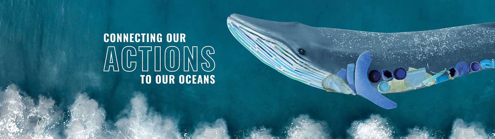
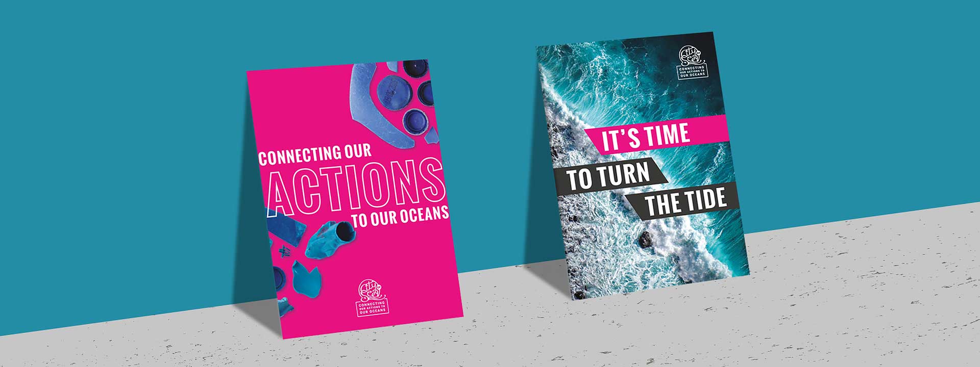
I worked with City to Sea to elevate their brand presence and create a visual identity that would make their mission impossible to ignore. Having already distilled their mission into a simple, powerful strapline: “Connecting our actions to our oceans”. They wanted the brand to make a direct visual link between everyday choices and ocean impact.
Visual Identity:
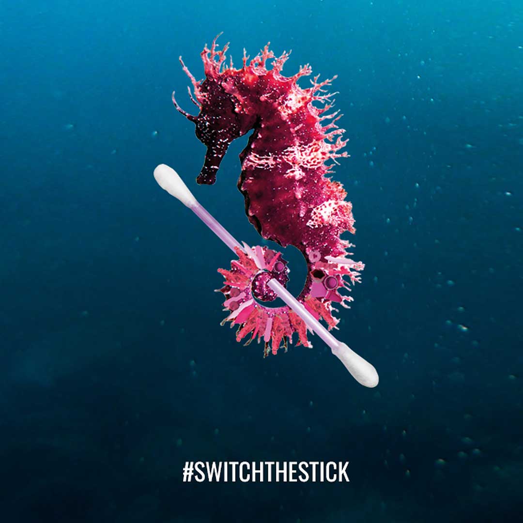
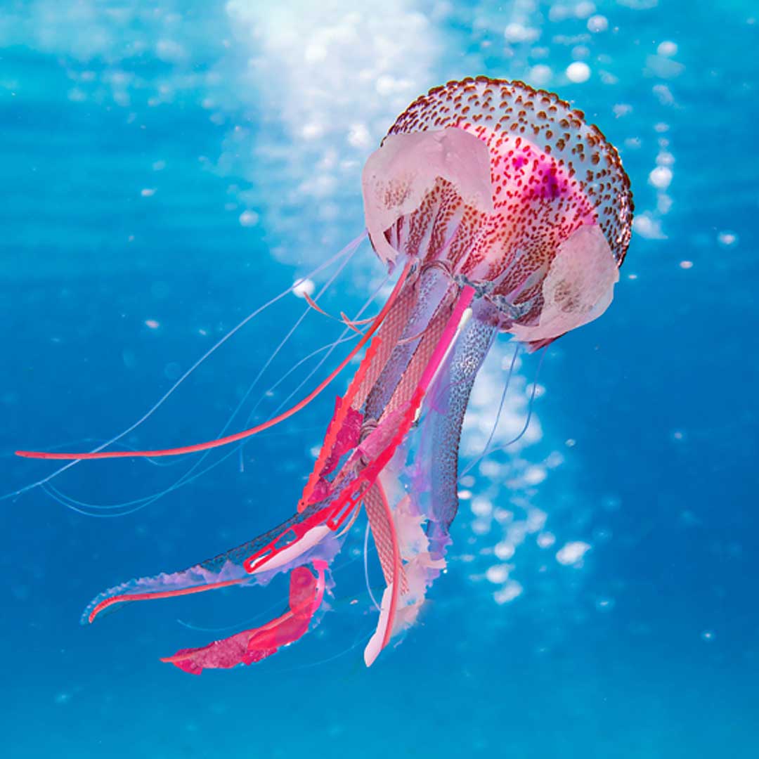
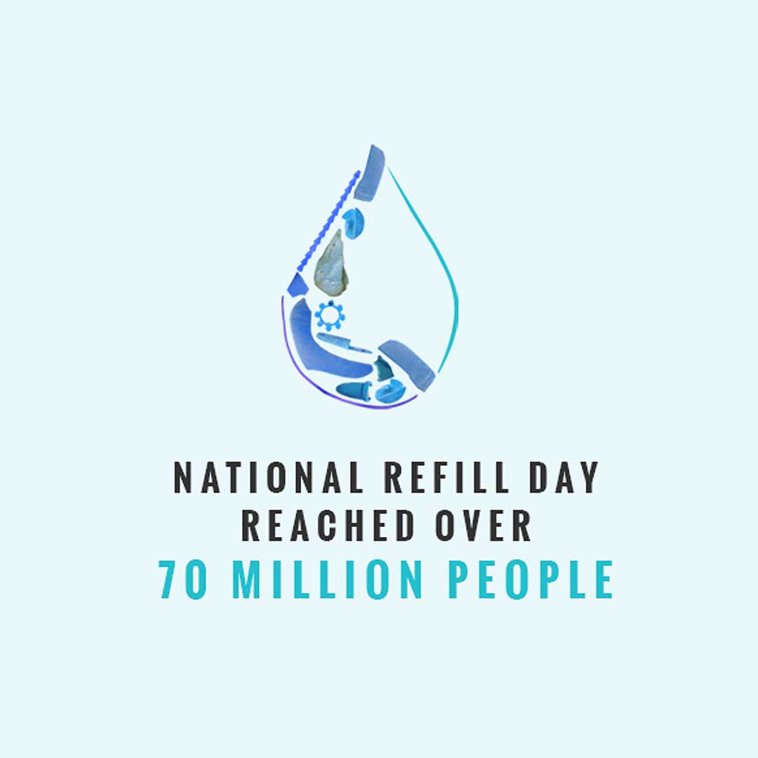
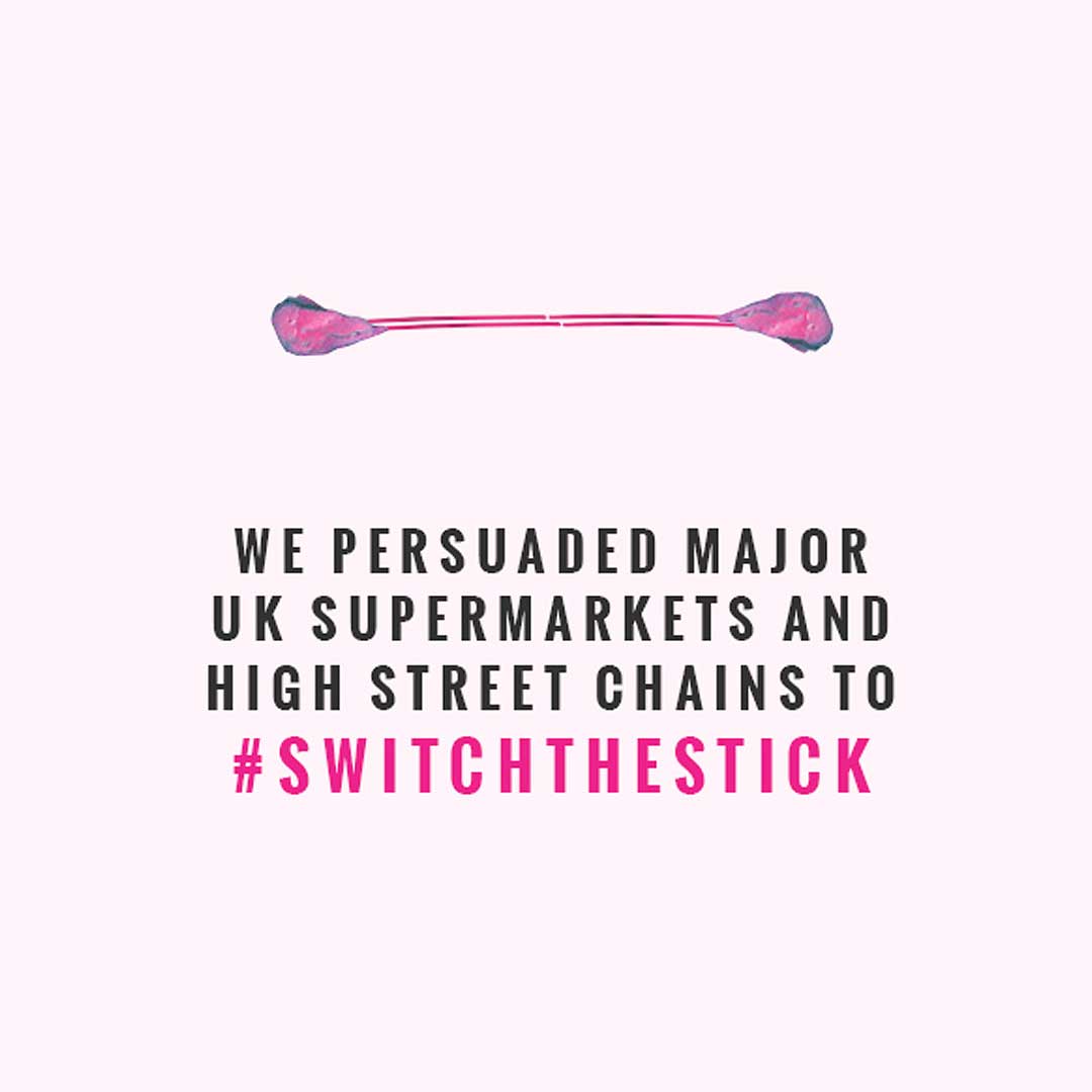
- Designed a suite of assets using actual plastic pieces washed up on beaches, keeping the real-world consequences of plastic pollution front of mind
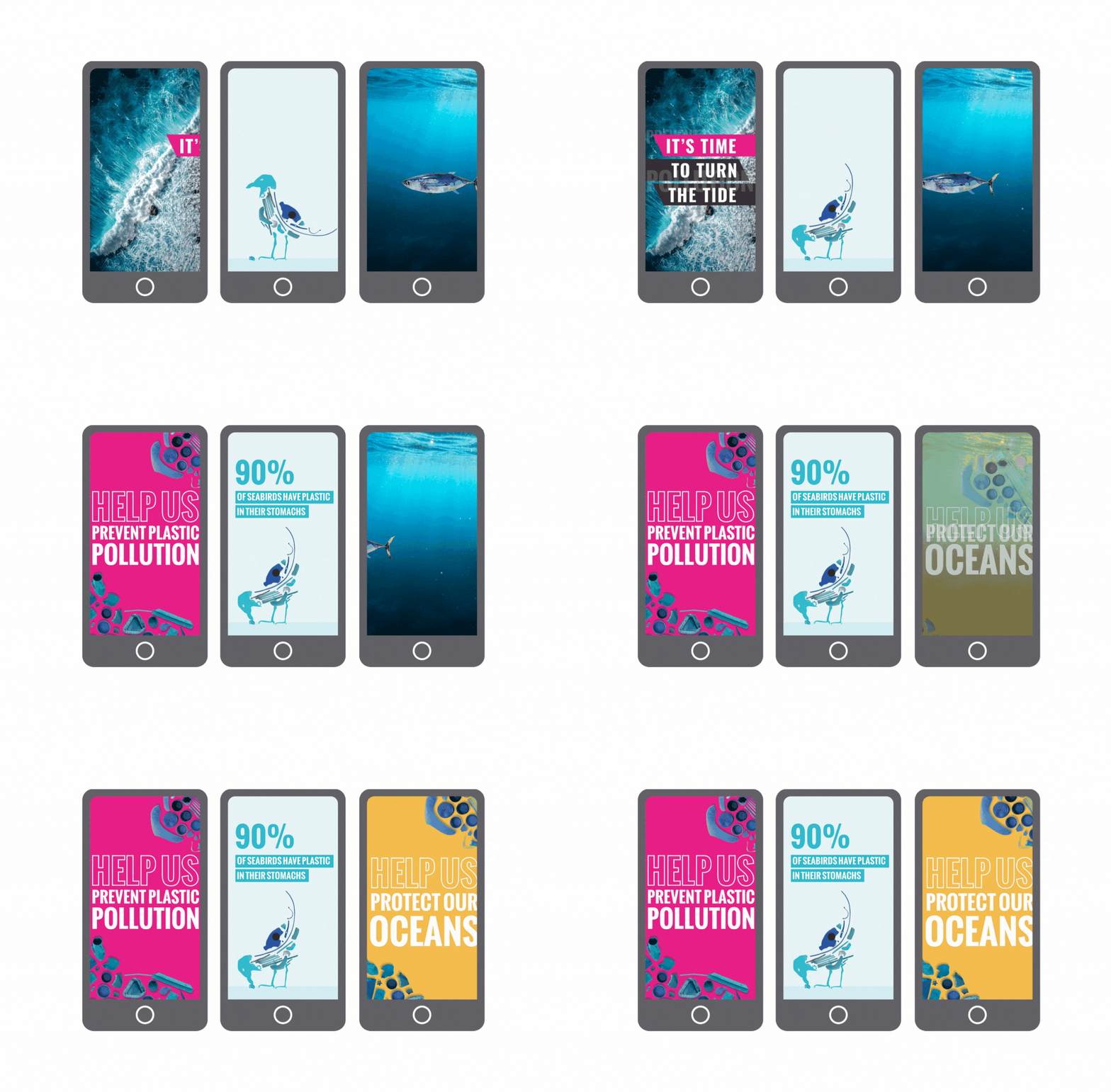
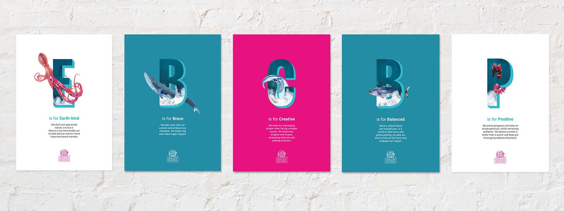
- Developed a bold colour palette using strong, positive ocean and beach tones, punctuated by a stand-out brand pink for contrasting impact
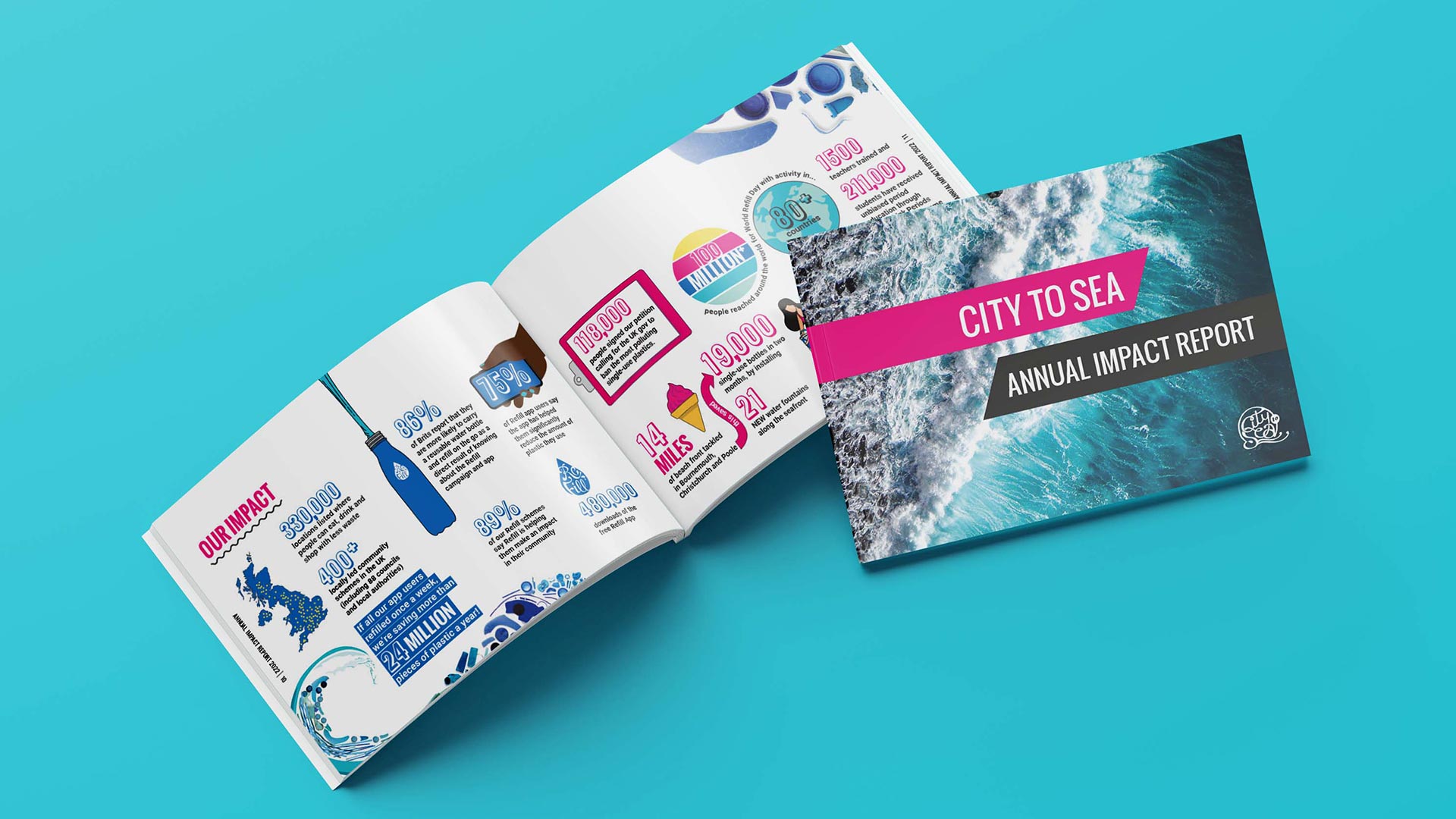
- Carefully considered typography using varied font sizes and blocks of colour to highlight key information and statistics, making data digestible and compelling
The approach ensured that every touchpoint reinforced what the community was fighting for—transforming abstract environmental concerns into a tangible, visible reality.

The Results
The rebrand positioned City to Sea as the recognised force behind multiple successful behaviour change campaigns:
- 200% increase in media coverage in the space of 2 years
- Expanded campaign portfolio beyond Refill to multiple behaviour change initiatives
- Increased partnership opportunities with more organisations joining the fight against plastic pollution
- Stronger brand recognition connecting City to Sea’s identity to their growing impact
The cohesive brand identity successfully bridged the gap between campaign success and organisational visibility, establishing City to Sea as a leading voice in the movement to stop plastic pollution at its source.
Design & tonic are a dream to work with. They recently created a new brand identity for City to Sea, including concepting, brand guidelines, website, print materials and social assets. We’re beyond happy with the result! They've created something bold, bright and beautiful that helps us stand out from the crowd and connect our supporters with who we are and what we do. We not only look more professional and authentic, but we’ve seen a huge increase in engagement across our digital platforms.
-Jo Morley, Head of Marketing & Campaigns, City to Sea-